Brief
Design the main game pieces, referred to as “marbles,” for a match-3 game that’s nearing release.
Software Used
- Adobe Photoshop: For adding realistic effects and fine-tuning aesthetics.
- Adobe Illustrator: For crafting primary shapes and vector outlines.
The Challenge
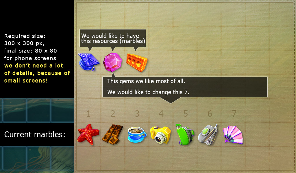
As the game neared its launch, a seemingly small detail became a focal point of discussion: the marbles. They are causing a great deal of debate. Everyone in their team agrees that they look nice, but also everyone who sees the game says that the marbles aren’t particularly interesting or competitive with other popular Match-3 style games.
Here are a few key points I considered:
- The design should strike a balance between intricate details and clarity on phone screens.
- The goal is to compete with game assets from leading titles like Candy Crush and Bejeweled, so innovative concepts are encouraged.
- Their latest teaser showcases marbles with a travel theme. Originally titled “Jetsetter Jam,” the game was renamed “Gummy Drop” and now blends elements from both concepts.
old game teaser they provided as reference © Big Fish Games
My Approach
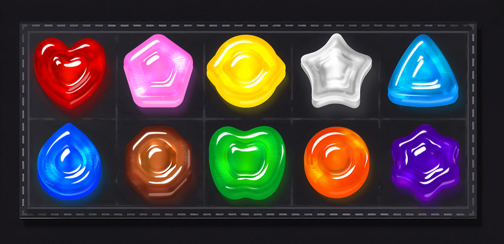
My suggestion is to try a set of marbles that doesn’t attempt to be thematic. Instead of trying to make marbles that fit the game’s travel or city theme, the game asset should focus on being pretty and sparkly, like gems. Make them look nice so that people will want to tap on them. Using gems or something similar will make it easier for people to get into the main part of the game and enjoy it without having to think too much about the theme and things like luggage, cameras, starfish, etc.
Before began producing the concept, I considered the following points:
- Stylized: The marbles should have a unique, polished appearance that stands out.
- Distinctive Shapes and Colors: Each marble should differ in shape and color to create visual interest and aid in gameplay.
- Small Screen Optimization: Ensure the marbles look great on small screens by balancing detail and simplicity.
- Juicy and Cute: Aim for a design that is both appealing and engaging, making the marbles enjoyable to interact with.
- Complete Circles: The shapes should fit neatly within their circular confines without gaps or holes.
- Versatile Backgrounds: The marbles should look good against both bright and dark backgrounds.
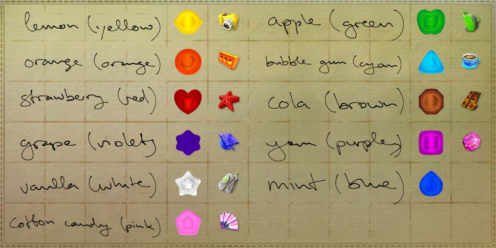
So, I gave each of the 11 pieces a simple shape and a different color. I chose which shape went with which color in some way (e.g. heart shape could be better red etc.)
To give them a sense of my design direction, I presented these initial concepts. They appreciated the ideas but requested a shift towards making the marbles resemble gummy bears rather than hard candies. I agreed with this feedback, believing it would enhance the overall appeal and make the marbles more engaging. I arrived at this design:
Several months after completing the project, I was thrilled to see that the game had gained global traction and was being downloaded by players around the world. I was pleasantly surprised to discover that several people I knew had downloaded the game without realizing I had designed the assets they were enjoying.
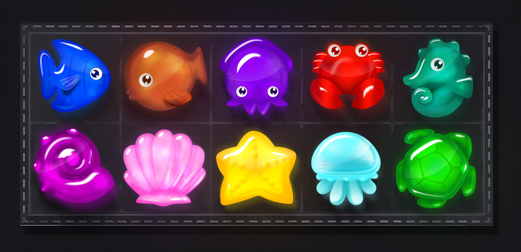
The team eventually reached out to me for a new project, this time requiring a set of icons with an underwater theme.
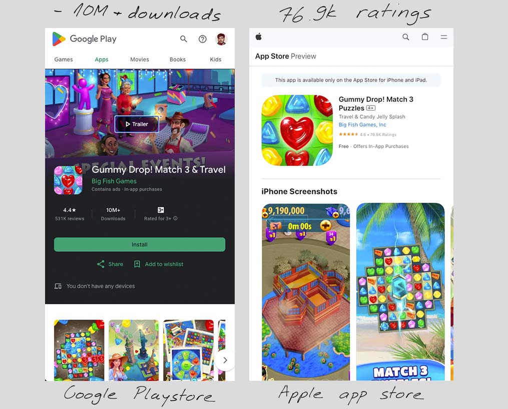
I decided to check in on the app’s progress (2024), and I was thrilled to see that it’s still thriving. With 10 million downloads on the Google Play Store and an impressive 76.9k ratings on the Apple App Store, it’s clear the app has captured the attention of a broad audience. These figures are a testament to the app’s continued success.