Brief
Create a logo for Alkermes’ newly established Commercial Operations & Effectiveness department, formed by merging three internal teams: Marketing Operations, Field Operations, and Training.
Software Used
The Challenge
With the integration of three distinct departments into one, Alkermes needed a unifying logo that represented this new entity. The challenge was to encapsulate the essence of each team while maintaining a cohesive identity that aligned with Alkermes’ brand guidelines.
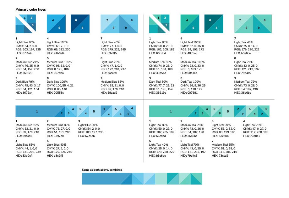
Despite receiving detailed information about the department’s objectives, vision, mission, and the company’s brand guidelines, the brief was intentionally open-ended. The client encouraged creative freedom, asking for multiple logo variations without providing a specific direction. However, adherence to Alkermes’ established color palette was non-negotiable.
My Creative Approach
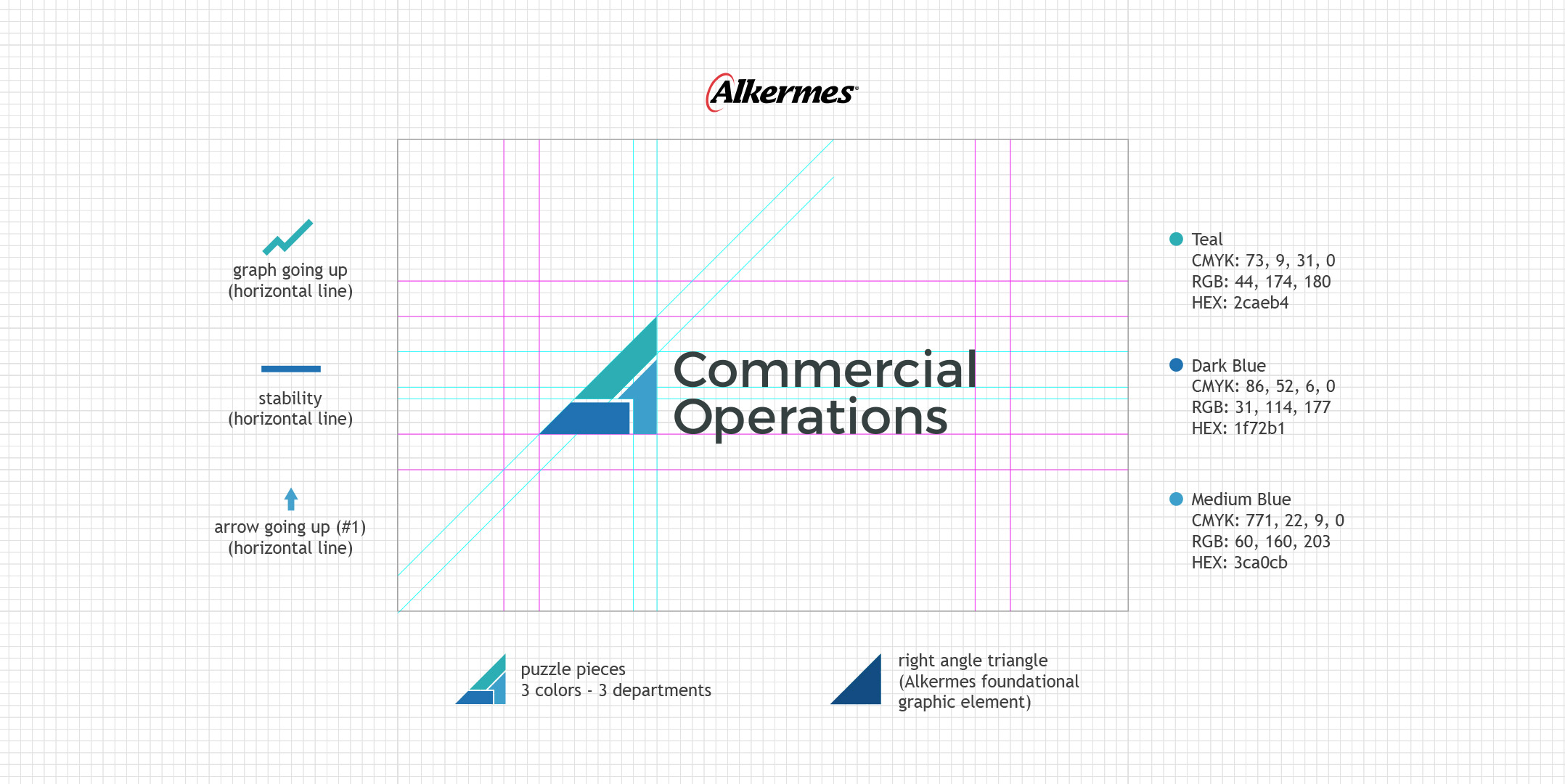
Given the flexibility, my initial step was to thoroughly understand the unique functions of each team and how they contribute to the overall mission of Commercial Operations & Effectiveness. This understanding guided the conceptualization of various logo designs, each exploring different ways to visually integrate the three teams.
My goal was to create a series of logos that would resonate with the department’s combined purpose, while still allowing each team’s identity to shine through. I experimented with symbols, abstract shapes, and typography that could symbolize collaboration, efficiency, and unity, all within the color constraints of the Alkermes brand.
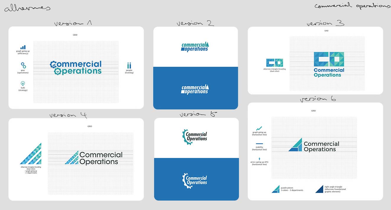
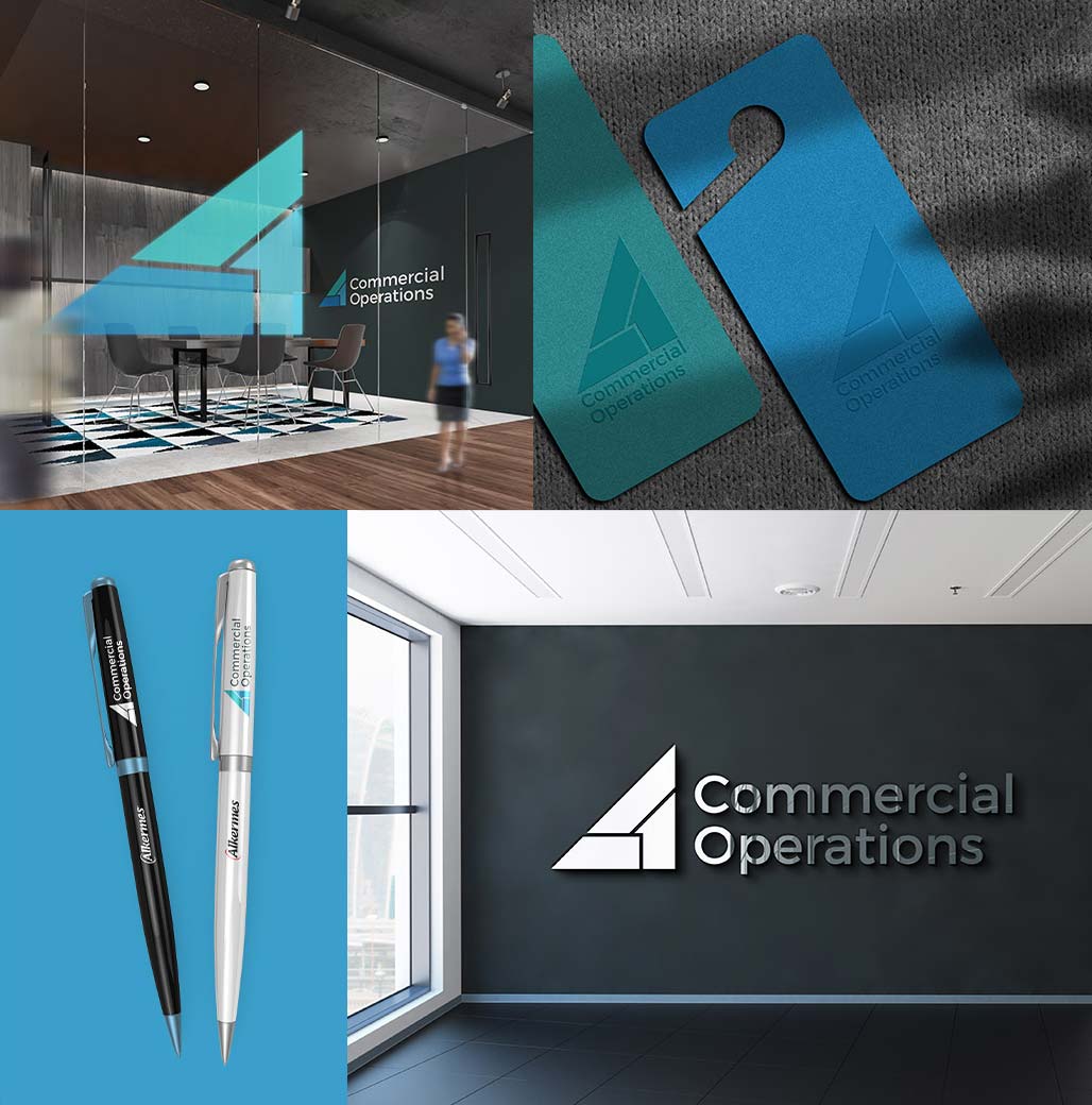
The result was a collection of diverse logo concepts, each offering a unique take on the department’s identity, yet all tied together by a consistent and professional aesthetic that reflects Alkermes’ corporate image.
Designed with the company’s branding and the department’s envisioned concept in mind, each one comes with an explanation of relating to its core concept.
I simply experimented with type, icons, and marks open to multiple interpretations. To emphasize that these are not finalized designs but rather just examples from which a final logo might be derived, I emphasized that they are not yet in perfect form and could be further improved.
Some of the designs were favorites, but they ultimately settled on one that they felt best represented the concept. Finally, I made some minor adjustments to the logo to make it more detailed, as well as visually perfect along grids and spaces.